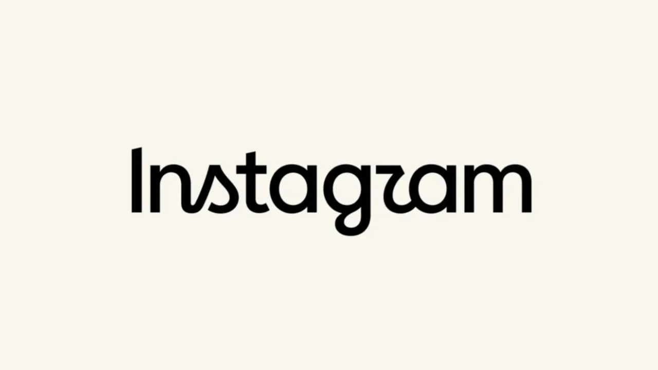
Instagram updated its visual identity on August 14, 2026, replacing its decade-old script wordmark with a hybrid typographic design. The Meta-owned platform deployed this fresh visual update globally across its mobile applications and desktop interfaces, signaling a major shift in its public-facing aesthetic.
This design modification marks the first major overhaul of the platform’s primary text logo since 2016. The updated branding aims to improve digital legibility on high-resolution smartphone screens while retaining vital brand heritage.
Key Facts of the Visual Update
- Instagram introduced the new wordmark globally on August 14, 2026.
- The design replaces the 10-year-old cursive script with a hybrid of script and sans serif typography.
- Meta directed the redesign to optimize visual rendering across various screen sizes.
- The iconic gradient app icon remains unchanged in this specific branding iteration.
- The typography shift aligns with broader industry trends toward minimalist interface design.
The Evolution of Digital Typography
Typography in consumer technology must adapt to changing hardware standards and software interfaces. Digital screens demand clarity, scalability, and cross-platform consistency. Pure script fonts often suffer from rendering degradation at smaller scales. The integration of sans serif typography ensures that the brand name remains sharp and readable.
Design teams at major technology corporations frequently evaluate their brand assets to maintain relevance. A decade represents a significant lifecycle in digital design. The previous cursive aesthetic reflected the filtered, artisanal photography culture of the mid-2010s. Modern social platforms prioritize clean architecture and high-speed information consumption.
This transition mirrors similar rebranding exercises by industry peers. Technology platforms shift toward geometric clarity to signal maturity and technological precision. The new Instagram wordmark balances its historical recognition with contemporary visual standards, bridging past nostalgia with future utility.
Technical Optimization for Modern Screens
Rendering engines on modern smartphones process complex vector graphics differently than they did a decade ago. High pixel density displays require letterforms that avoid pixel distortion at microscopic scales. A hybrid typographic approach solves this engineering challenge.
Designers combined fluid handwritten curves with structured, neutral letter structures. This combination prevents the visual fatigue associated with overly ornate typography in cramped mobile navigation bars. Every pixel of the new wordmark undergoes grid alignment to match standard UI components.
Performance metrics dictate that interface assets load rapidly without visual artifacting. Simplified character geometry reduces file sizes for web and mobile components. This technical adjustment contributes to overall application performance improvements, ensuring smoother user navigation.
Market Strategy and Brand Identity
Brand consistency across a sprawling ecosystem requires adaptable visual assets. Instagram operates across billions of distinct devices, ranging from budget Android hardware to high-end desktop displays. A robust wordmark reinforces corporate identity without visual friction.
Market competitors constantly monitor visual signals to gauge strategic shifts within dominant platforms. By modernizing its typography, Instagram signals its ongoing commitment to interface refinement. This change reinforces market leadership through subtle yet deliberate aesthetic evolution.
Corporate rebranding carries inherent financial and user-experience risks. Sudden visual changes can alienate long-term users accustomed to familiar touchpoints. Instagram mitigated this risk by retaining the foundational script DNA within the new hybrid structure.
Historical Context and Industry Trends
The movement toward simplified, hybrid typography is not unique to Instagram. Over the past five years, major tech giants including Google, Yahoo, and various social media platforms have transitioned from ornate logos to highly optimized, scalable typefaces. This trend stems directly from the proliferation of mobile-first consumption habits and the rise of smartwatches, foldables, and diverse display form factors.
In the mid-2010s, skeuomorphism and playful handwriting fonts dominated digital branding to evoke warmth and approachability. As digital ecosystems matured into critical infrastructure, corporations shifted their focus toward utility, trust, and instantaneous legibility. Instagram’s 2016 transition to the colorful gradient icon was the first step in this journey; the 2026 wordmark update completes the modernization of its core identity system.
Stakeholder Impact and User Reception
Every major redesign affects a diverse group of stakeholders, from everyday consumers to enterprise partners and UI/UX designers. For the standard user, the change is subtle enough to avoid jarring cognitive friction, yet distinct enough to feel modern. Creators and businesses relying on the platform benefit from a more authoritative, polished brand umbrella that projects stability.
Conversely, design purists and brand nostalgics often critique such updates for stripping away distinct character in favor of corporate uniformity. However, usability data consistently shows that high-contrast, hybrid letterforms perform significantly better in accessibility testing, particularly for users with visual impairments navigating dynamic mobile apps.
Comparative Analysis with Industry Peers
When comparing Instagram’s 2026 refresh to recent overhauls by competitors like TikTok or YouTube, a clear industry standard emerges. While TikTok relies on kinetic, glitch-inspired branding and YouTube maintains a bold, geometric corporate stamp, Instagram has chosen a middle path. By preserving the flowing motion of its historical script while anchoring it with structural sans-serif stability, the platform avoids the cold sterility of pure geometric minimalism while solving technical rendering hurdles.
Future Implications for Digital Branding
The success of this typographic update will likely influence other subsidiaries under the Meta corporate umbrella. Standardizing design systems across Facebook, WhatsApp, and Instagram remains a core engineering priority. Unified typography strengthens corporate design language across diverse application suites.
As mixed-reality headsets and wearable displays gain market share, interface legibility becomes even more critical. Brands must design assets that render flawlessly in three-dimensional virtual environments. Today’s hybrid wordmark represents a stepping stone toward spatial computing design requirements, ensuring the brand remains future-proof for the next decade of hardware innovation.
Why This Matters
Corporate design changes by dominant technology platforms dictate global visual standards. When a platform with over two billion active users alters its typography, software designers worldwide take notice. This update establishes a benchmark for balancing nostalgia with modern digital utility.
Consumers interact with digital interfaces thousands of hours per year. Small typographic adjustments influence subconscious brand perception and digital comfort. Understanding these design choices reveals how technology giants engineer consumer trust and visual engagement.
Source: Original Article